Digital Style Guide
1 Introduction
This website is built with Jekyll using Bootstrap 4. Design patterns and components from these libraries should be understood when the website is being updated so that they can be effectively implemented when needed.
Wherever feasible we have allowed content to be written in Markdown, especially for content such as documentation and news, that we hope will be team supported. There are pages requiring complex formatting however where we have used HTML markup.
This website is hosted on Github pages, the master repository can be viewed here.
2 Logo
It is important to apply the Opentrack logo consistently across all media and collateral to ensure the clarity and recognition of the brand.
2.1 Logo options
Full logotype
 Generally the logo should always be presented in full, displaying both the symbol and word-mark. This is especially true in marketing situations where the audience may not have heard of the company before, or the brand is being presented ambiguously out of any context, on a bill board or hoarding for instance.
Symbol alone
 In situations where there is confidence the audience is already familiar with the brand, for instance on customer resources and apps, then it is acceptable to use the symbol alone. This can protect branded collateral from appearing cluttered or busy.
Wordmark option
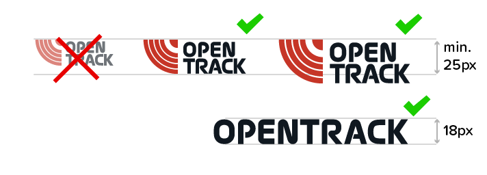
 Where vertical display space is very limited, this standalone wordmark is available to use. This version of the logo ensures the company name remains clear and visible when displayed at restricted heights such as less than 25 pixels tall on a digital screen.
2.2 Treatment
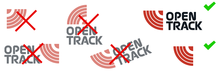
Don’t flip, rotate or rearrange
The logo must never be rotated or flipped; the symbol’s tracks must always be oriented like the bottom left corner of a circle, so it appears similar to a lower-case “t”.
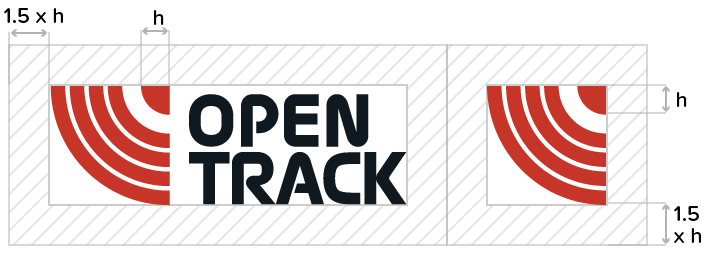
Ensure ample white space
There should also always be some white space around the logo, this should be at least as wide as 1.5 × the width of the corner dot at the top right in the symbol.
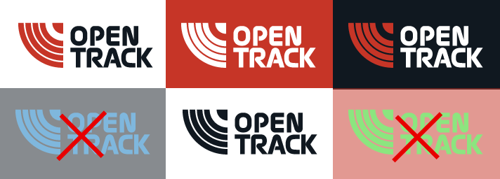
Keeps colours consistent
The logo should always be in either Track-Red, Track-Black or white; or a combination of these colours. It is preferred that Track-Red be used on the symbol where possible. Please consult branding department before presenting the logo in any different colours to ensure consistency is maintained.
Ensure adequate sizing
When working in digital, the logo and symbol should never be displayed at sizes less than 25 pixels tall. Ideally 32px tall or bigger. With print it is imperative that the logotype is legible for the context in which it will be used. It is preferable to use the wordmark if sufficient space is not available and legibility may be compromised.
A collection of logo files can be downloaded here.
3 Colours
Opentrack have a colour palette that should be referred to whenever creating new resources and assets, this consists of 4 main colours:
3.1 Brand palette
Track Red #C63527 (Primary colour)
Track Black #101820
Track Blue #0274BD
Light Steel #C7D4DD
3.2 Background colours
We use tints of the main colours throughout the website as background panels. To implement use the classes .tinted, .bg-steel, .bg-blue, .bg-black and .bg-red on containing elements.
4 Typography
4.1 Typefaces
Main typeface we use is Proxima Soft, this is a premium typeface by Mark Simonson available through Typekit and MyFonts.
If creating documentation or apps where this typeface is not available then you may use the similar Google font Nunito.
4.2 Headings
The templates support the full range of header style:
Heading 1 is for main page title
Heading 2 is used to title page sections
Heading 3 is for section subtitles
Heading 4 is good for small blocks of content
These headings can all be written in markdown, and if it is desired to pull a number from a h2 tag as can be seen in the section titles in this page, all that is necessary is to wrap the number in <strong> tags. eg:
- html :
<h2><strong>2</strong> Typography</h2> - markdown :
## __2__ Typography
4.3 Blockquotes
Blockquotes are used on the website and styled to highlight the text, they pair well with p and h3 tags and you should include the quotation marks as these are offset on the first line. If writing quotes in Markdown, it is necessary to include the source of the quote on a new line within <small> html tags, for example:
> “This is a quote automatically paragraphed from Markdown”
    <small>Source of the quote</small>
“This is a quote automatically paragraphed from Markdown”
Source of the quote
5 Images
5.1 Screenshots
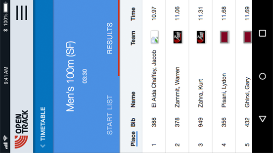
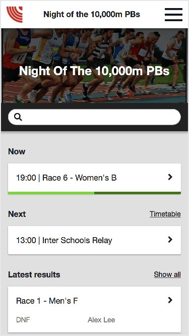
There is built in support to show screens within a pre-styled device frame, here is an example of a tablet.
Find out about size and markup requirements in the devices section below.
5.2 Regular images
Wrapping the <img> within a <figure> tag will automatically make that image responsive and bordered.
5.3 Captions
Use the <figcaption> tag within the <figure> tag, at the end just before the closing </figure>, to label your images.
6 Devices
Opentrack stylesheets and digital assets support displaying product screenshots directly in visuals of key devices.
Currently we support smartphone portrait (.phone-demo), smartphone landscape (.phone-landscape-demo), tablet landscape (.tablet-demo) and browser (.browser-demo) screenshots which are easily displayed on the website by using the standard code template.
6.1 Screenshot dimensions
For best presentation it is recommended that all screenshots conform to the advised aspect ratio / sizes. The dimensions given are minimum requirements, however it is recommended to double these dimensions to maintain crisp display on retina devices.
- Mobile phone: 192px x 343px (optimum 384px x 686px)
- Tablet: 430px x 322px (optimum 860px x 644px)
- Browser: 728px x 485px (optimum 1456px x 970px)
- Mobile phone landscape: 728px x 357px (optimum 1456px x 714px)
6.2 Positioning
These devices can be specified to display on the left or right side or in the middle of the page.
To place the device to the side (only works on larger displays) wrap the containing <figure> tag in a div with class="side-image side-image-right" or class="side-image side-image-left".
The devices images are responsive and will resize automatically with side images repositioning into the centre of the page on smaller screens.
6.3 Animation
We use the Animate On Scroll library to bring elements on the page to life.
To affect how the device enters the screen include a data-aos attribute with a value fade-up, fade-left or fade-right. These effects can be used on any block level element.